
Overview
We were tasked with creating AnthologyAI's first B2B platform. The goal was to develop a sales tool that allows potential clients to explore our offerings, understand how they can use our products, and ultimately reduce sales time.
Team
Product Designer - Nicolle Diiorio
Technical Product Manager - Shreya Sathya
Front End Developer - Kyle McDaniel
Environment for product comprehension
Test and validate our data solutions within their specific business contexts to better understand their value
Showcase our product portfolio
In-depth product exploration that highlights features, benefits, and potential applications across various industries.
Facilitate effective pre-sales activities
Enable our team and potential clients to explore our offerings and understand their value proposition in a user-friendly environment.
Create a destination for prospects
Provide educational materials and tailored content, (data dictionaries, data samples, resources etc.) capturing and nurturing potential business opportunities.
With a diverse range of personas, it was challenging to cater to everyone without overwhelming the user. It was crucial to ensure each persona could easily find what they were looking for while maintaining a streamlined, user-friendly experience.

"The most important thing is being able to quickly validate that the data will solve our specific use case."

"Show me the statistical distributions and methodology behind your derived features."

"Beyond the data costs, I need to understand the total integration effort and ongoing maintenance requirements."

"The most important thing is being able to quickly validate that the data will solve our specific use case."

It was crucial to address both the sales team's and the user's pain points simultaneously, as the biggest sources of friction often occurred on both sides. The sales team faced uncertainty in determining what would be most relevant to share, while users struggled to fill in the gaps and understand how our offerings could best serve their needs.

After identifying the sales team's pain points, we gained valuable insights into how the platform should align with the sales process. While the focus of this project was on the middle section—the Enterprise Platform—it was essential to consider the entire journey to ensure a cohesive experience across all touchpoints, effectively guiding leads through the pipeline.
Generating Quality Leads
It was crucial for the content to be accessible, but its sensitive and dense nature made it unsuitable for our marketing site. We decided to host the content on a platform where users only needed to create an account to access it. This strategic decision allowed the sales team to track user activity and interactions. It also provided potential customers with a quicker way to explore our offerings without having to engage directly with our team.
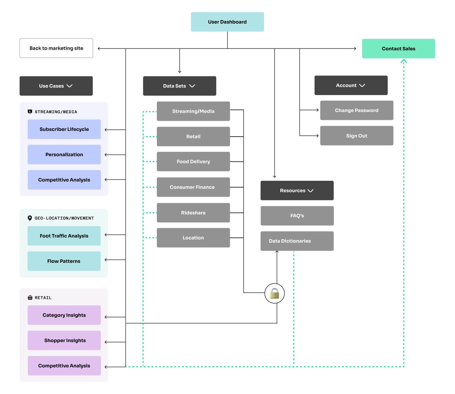
This is MVP sitemap. We have three main verticals of use cases and six different data sets for users to explore in v1. Data-minded folks will interested in the data sets while other users may prefer the use cases. It was important to make both available from the dashboard to ensure users can quickly find their preference.

In order to customize our user's experience we capture a few details about them on sign up like, Company, Role, and Vertical or Industry. This helps us tailor their dashboard experience and is used by sales to evaluate leads.
.jpg)
We push the most relevant content to the top of the page based on the user's role and industry. Each use case includes a brief summary and tags so the user can quickly decide which is most useful for them.
Learning Tool
Since this is v1 we are still learning what works. We decided to include quick links to other types of content on this page in the user finds something else more relevant than what we pushed to them. We will have user tracking enabled to get metrics on this and inform future iterations.
.jpg)
This is one of the use case pages. It was important to include a summary at the top of the page so the user knows before scrolling if this is the content for them. Next we want to make sure the data was front and center. Our data-minded personas are going to go straight to these tables.
Functionality
All of the tables throughout the platform are interactive. The user can easily sort, filter, and scroll through 100s of rows. This was a priority to include because most users will expect this functionality. Since all tables are interactive, we decided to only show them on desktop devices. If the user visits a page with data tables on a mobile phone, they will be directed to head to a desktop device for the full experience.
Sales Needs
I decided to include CTA's after every dataset on the site for a few reasons. The first is everything on the site is a sample, so if the user is interested in this specific table there is plenty more for them to explore. The second reason is tracking. Sales will know exactly which CTA the user clicked and when. This gives sales and great jumping off point on their next interaction.
.jpg)
This is an example of a data set tailored for the data-minded persona, designed to give users a preview of what our data looks like. If they want a deeper understanding, they can navigate to the corresponding data dictionary, which requires additional authentication for access.
After launch in early Q1 of 2025, we will track platform performance through our third party analytics platform. Daily monitoring will focus on user account creation, content interaction and downloads, lead quality and overall sales cycle. These insights will directly inform our V2 roadmap, helping us identify the most valuable features and content to prioritize in future iterations.

Revamp of the Caden's Vault with ID verification.

The first personal AI trained on user data within the Caden App.

Study to decrease drop off rate.

First version of the design system used to launch the Caden App.