
Insights
Overview
This is the first version of Caden User Insights—think of it as 'Spotify Wrapped,' but with a wider range of data categories and accessible year-round. The goal is to attract a new type of user, one motivated to add data sources in exchange for valuable insights, rather than the current user base, which is primarily driven by earning money.
Benmarking

Research of other apps "Wraps". There was no shortage of examples.
Considerations
Easily Reproducible
Partnering with the data and engineering teams was crucial to ensuring the insights are both accurate and repeatable. Since users will receive new insights on a regular basis, it was essential to establish a scalable system that eliminates the need for engineering to build new screens each time.
Actually Insightful
In order for these to drive behaviors, they would have to make users excited and want to learn more and share them. I partnered with data, tech and marketing to figure out what the insights could be and how we could make them interesting and relevant for users.
Shareable
If we achieve the above, users will be encouraged to share and compare insights with friends, ultimately driving user growth. To support this, I collaborated with Engineering to ensure all potential solutions can be easily shared on social media or via text.
Learning Tool
Since this is the first version, we plan to use it as a foundation for shaping future iterations. We'll analyze which types of insights resonate best with specific users, the most effective formats, an optimal delivery frequency, and what drives the behaviors we are looking for.
User Journey

Users have numerous opportunities to engage with insights, so we aimed to ensure there’s something compelling for everyone, regardless of how much data they’ve connected. The different formats were carefully designed to serve distinct purposes, as you can see.
Company Wide Brainstorm
Held a session with the entire company (which may have been 8 people at the time) to brainstorm insights we could create with the current data resources we had.

Categorize

The next step was to figure out where these should live. In-feed teasers were for users who had very little data, they could see interesting things about other users, evoke a sense of "FOMO" and drive more data connections
The In-Feed Personalized insights were in the same format as the teasers but were personalized and more factual than stories. Ex. Total number of Uber rides or total spend on Amazon. Not something all user's will want to share but, will still find interesting.
Stories are the fun, weird and shareable ones. The goal for these was for users to share with their networks and gain some buzz.
Story Insights

High-level wireframes.
In-Feed Personalized & Teasers

Users are always prompted to make more connections whether they have data connected or not.
In-Feed Templates

In order to keep engineering scope to a minimum we came up with templates that would house all the insights. This ensures they are easily repeatable and the we can easily add in the variable or image for each user.
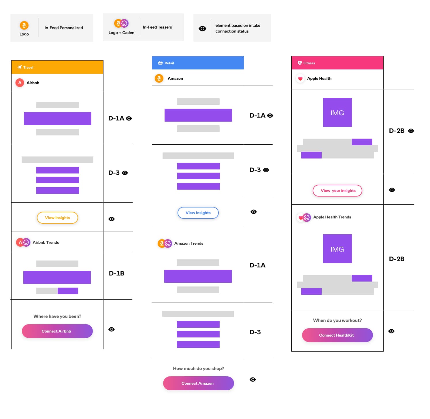
Zooming out a bit, this is an example how the templates live within the cards on the feed. Think of these like blocks, certain elements are turned on or off depending on what data sources the user has connected.
Story Templates

Applied the same system to the story format. These differed sliently because of the two types of variable text.
Story UI

A few examples of how everything came together.
Prototype
Scroll to see the in-feed insights and user stories
What's Next?
The data team will continue to improve the data quality which will allow the team to build more dynamic and interesting insights. I will partner with product to monitor metrics on the variables to determine the next iteration of products.


